
Equity curve analysis is the process of computing, plotting, and measuring a strategy's cumulative net profit over time or trade number to diagnose consistency, risk, and edge. Before anything else, compute a trading-only equity curve that deducts every commission and slippage charge from each trade. That single step separates real performance from accounting noise.
Before you go deeper, confirm three things:
- Data integrity: every trade is present, correctly dated, and carries its actual fill price.
- Net vs. gross: the curve reflects realized net P&L, not gross P&L before costs.
- Series type: you know whether you are working with a trade-indexed series or a calendar-time series, because the choice affects every statistical test you run.
Key Takeaways
A correct net equity curve, computed from closed-trade P&L net of all costs and stripped of external cashflows, is the single most reliable instrument for diagnosing strategy health and managing live risk.
| Point | Details |
|---|---|
| Compute net curve first | Strip deposits, withdrawals, commissions, and slippage before analyzing any metric. |
| Run Monte Carlo validation | Resample trade returns 1,000+ times to estimate tail-risk MDD beyond the backtest history. |
| Use dual-MA gating | A fast/slow MA crossover on the trade-count curve reduces whipsaws versus a single MA. |
| Monitor recovery time | Prolonged flat periods signal edge loss even when drawdown depth appears moderate. |
| Require independent verification | Any managed strategy should publish a public, read-only performance link with net figures. |
| Sonicaigold for managed XAUUSD | Offers 18+ months of verified results via Myfxbook with transparent net equity reporting. |
Table of Contents
- What an equity curve actually measures — and which type you need
- How to calculate a net equity curve step by step
- Key metrics every quant should compute from an equity curve
- What common equity curve shapes tell you about your strategy
- Practical analysis techniques: MA gating, segmentation, and statistical tests
- How to plot equity curves so the chart actually tells you something
- Tools and a reproducible workflow for equity curve analysis
- Common mistakes that make equity curves misleading
- A numeric worked example: compute, plot, and test a gating rule
- Applying equity curve gating to a managed XAUUSD strategy
- What to monitor and report for every live strategy
- How experienced traders actually use equity curve analysis day to day
- Verified gold auto-trading with a transparent equity curve
- Sources
What an equity curve actually measures — and which type you need
An equity curve is a plot of cumulative account equity across either trade number (trade-based) or calendar time (time-based), net of transaction costs, slippage, deposits, and withdrawals. It is the primary diagnostic for strategy consistency and risk.
Trade-based vs. time-based: the practical difference
A trade-based curve increments the x-axis by one unit per closed trade. It normalizes for trading frequency, so a strategy that fires 10 trades in January and 2 in February shows equal spacing on the x-axis. Statistical tests for slope significance and serial correlation are more valid on a trade-based series because each observation represents one independent decision unit.
A time-based curve plots equity at fixed calendar intervals (daily, hourly). It captures real-world exposure, including overnight gaps and weekend risk, and is the right format for comparing strategies with different trade frequencies or for overlaying market-regime data. The tradeoff: sparse trading periods create flat stretches that can visually distort drawdown duration.
| Dimension | Trade-based curve | Time-based curve |
|---|---|---|
| X-axis unit | Trade number | Calendar date/time |
| Best for | Statistical tests, MA gating | Regime overlays, multi-strategy comparison |
| Drawdown duration | In trade counts | In calendar days |
| Frequency normalization | Yes | No |
| Deposit/withdrawal impact | Minimal (trade-indexed) | Visible as step changes |
How external cashflows distort the picture
Deposits inflate equity without any trading edge. Withdrawals create artificial drawdowns. A "pure trading" equity curve strips both out, starting at a fixed notional base and adding only realized net P&L. Quantopia's breakdown of the four curve components (x-axis, y-axis, data points, drawdown shading) makes this separation explicit: the curve should reflect trading decisions, not cashflow timing.
How to calculate a net equity curve step by step
The core formula is straightforward:
CurrentEquity = PreviousEquity + NetP&L(trade) + Deposits − Withdrawals
where NetP&L(trade) = GrossP&L − Commission − Slippage.
For a pure trading curve, set Deposits and Withdrawals to zero and initialize at a fixed starting balance. TradesViz's formula guide confirms this approach for healthy-curve benchmarking.
Step-by-step calculation
- Export your raw trade log with columns: TradeID, EntryDate, ExitDate, GrossP&L, Commission, Slippage.
- Compute NetP&L for each row:
NetP&L = GrossP&L − Commission − Slippage. - Sort rows by ExitDate (or trade number for a trade-based curve).
- Set Equity[0] = starting balance (e.g., $10,000).
- For each subsequent row i:
Equity[i] = Equity[i−1] + NetP&L[i]. - Log any external deposit or withdrawal as a separate cashflow series, not as a trade row.
- Plot Equity[i] against trade number or ExitDate.
- Run a sanity check: sum all NetP&L rows and confirm
Equity[final] − Equity[0]equals that sum.
Worked numeric example
Starting balance: $10,000. Sanity check: sum of Net P&L = $752; $10,752 − $10,000 = $752. Confirmed.
Open positions in live monitoring
For live dashboards, include floating (unrealized) P&L in the equity value so the curve reflects current exposure. For backtesting, use only closed-trade equity to avoid look-ahead contamination. Keep the two series clearly labeled and never mix them in the same chart.
Key metrics every quant should compute from an equity curve
Raw curve shape is informative but not precise. These metrics quantify what the shape implies. AlgoTradingLib's metric catalog lists max drawdown, recovery time, profit factor, and recovery factor as the core set for algorithmic strategy assessment.
Core metric formulas
- CAGR:
(FinalEquity / InitialEquity)^(1/Years) − 1. Annualizes total return. - Absolute return:
(FinalEquity − InitialEquity) / InitialEquity. Simple total gain. - Max drawdown (MDD):
max(PeakEquity − TroughEquity) / PeakEquity. Largest peak-to-trough decline as a percentage. - Drawdown frequency: count of distinct drawdown episodes divided by total periods. Signals how often the strategy loses ground.
- Recovery time: calendar days (or trade count) from trough back to the prior peak. Prolonged flat periods can indicate loss of edge even when drawdown depth is moderate.
- Volatility: annualized standard deviation of period returns.
σ_annual = σ_period × √(periods per year). - Sharpe ratio:
(MeanReturn − RiskFreeRate) / σ_returns. Measures risk-adjusted return. See Sharpe ratio interpretation for practical thresholds. - Sortino ratio: replaces σ with downside deviation only, penalizing negative volatility more heavily than positive.
- Profit factor:
GrossWins / GrossLosses. A value above 1.5 is a common minimum threshold for live deployment. - Recovery factor:
AbsoluteReturn / MaxDrawdown. Measures how much return the strategy generates per unit of worst-case loss.
Rolling metrics and why they matter
Static metrics summarize the full history but hide regime shifts. Rolling Sharpe (computed over a trailing 50- or 100-trade window) shows whether risk-adjusted performance is stable or degrading. Rolling volatility flags periods of elevated risk that static annualized figures smooth over.
| Metric | Question it answers |
|---|---|
| CAGR | Is the strategy growing capital at an acceptable annual rate? |
| Max drawdown | What is the worst loss a trader would have experienced? |
| Recovery time | How long does it take to recover from the worst loss? |
| Sharpe ratio | Is the return worth the volatility taken? |
| Sortino ratio | Is the strategy penalized mainly by downside moves? |
| Profit factor | Does the strategy win more than it loses in dollar terms? |
| Recovery factor | How efficiently does the strategy convert risk into return? |
What common equity curve shapes tell you about your strategy
Shape is the first diagnostic signal. Before computing any metric, a visual scan of the curve narrows the hypothesis space considerably. Chart pattern recognition applies here: each shape maps to a probable cause.
- Steady upward slope: consistent edge, controlled position sizing, no major regime dependency. Check that the backtest period covers multiple market regimes before declaring the strategy robust.
- Steep then flat (plateau): edge may be regime-specific. The plateau often coincides with a volatility regime change or a structural market shift. Running a rolling Sharpe helps confirm the degradation point. Regime dependency and sample size are the two most common explanations.
- Steep and volatile (rollercoaster): high win rate but large individual losses, or inconsistent position sizing. Check the Sortino ratio and review the largest losing trades for sizing anomalies.
- Declining curve: strategy is losing money net of costs. Verify commissions are correctly included. If the gross curve is profitable but the net curve declines, the edge is smaller than transaction costs.
- Smooth parabolic rise: almost always a sign of overfitting. Live curves are lumpier than backtest curves; a suspiciously smooth backtest warrants immediate out-of-sample testing.
Recovery-risk guidance
A drawdown that lasts more than twice the historical average recovery time suggests the edge has changed, not just that the strategy is in a normal losing streak. At that point, hypothesis-driven testing (not emotional parameter tweaking) is the right response.
Practical analysis techniques: MA gating, segmentation, and statistical tests
These three techniques move equity curve analysis from observation to decision. The academic treatment in the ResearchGate paper on trading equity curves validates the empirical basis for applying systematic rules to the curve itself.
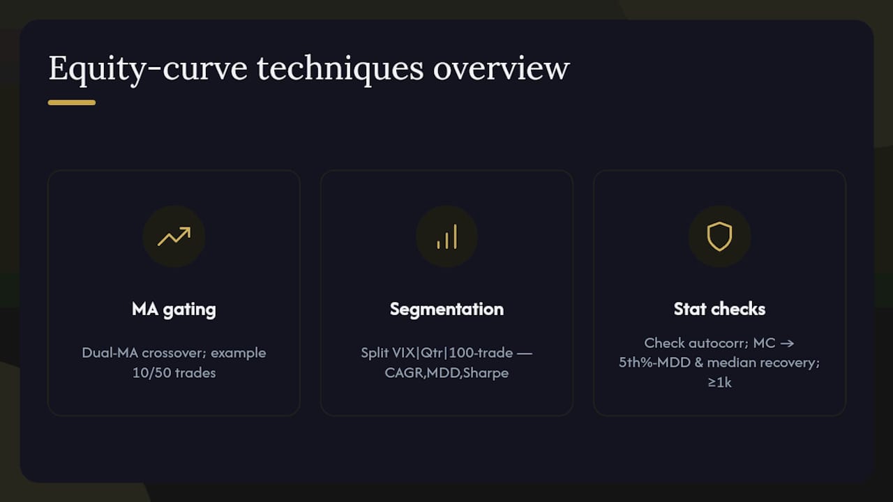
Moving-average gating
The core rule: pause trading when the equity curve crosses below its moving average; resume when it crosses back above. A single MA is simple but prone to whipsaws on noisy curves. Practitioners prefer a dual-MA crossover (fast MA crossing below slow MA = pause; fast MA crossing above slow MA = resume) because it filters short-term noise. Investopedia's equity-curve trading explanation also describes scaling exposure by distance from the MA as an alternative to binary on/off gating.
Parameter choices matter. A 10-trade fast MA and 50-trade slow MA on a trade-indexed curve is a common starting point. Time-based MAs (20-day / 100-day) work better for strategies with irregular trade frequency. Avoid optimizing MA lengths on the same dataset used to evaluate the strategy: that is curve-fitting.
Segmentation and seasonality
Split the equity curve by volatility regime (e.g., VIX above/below a threshold), calendar quarter, or trade block (every 100 trades). Compare CAGR, MDD, and Sharpe across segments. A strategy that performs well in high-volatility regimes but deteriorates in low-volatility periods needs a regime filter, not a parameter tweak.
Statistical checks
Serial correlation in sequential trade returns can invalidate standard t-tests. Run an autocorrelation check on the return series before applying any slope-significance test. If autocorrelation is present, use block bootstrapping rather than standard bootstrapping to preserve the dependence structure.
Monte Carlo simulation resamples the trade return distribution (with or without replacement) thousands of times to generate a distribution of possible equity curves. The key outputs are the 5th-percentile MDD (tail risk) and the median recovery time. A strategy whose 5th-percentile Monte Carlo curve still meets your risk tolerance is more robust than one whose median curve looks good but whose tail is catastrophic.
Pro Tip: Run at least 1,000 Monte Carlo iterations on your trade return series. If the 5th-percentile simulated MDD is more than twice your historical MDD, the strategy's tail risk is not captured by the backtest alone.
How to plot equity curves so the chart actually tells you something
A well-constructed chart surfaces problems in seconds. A poorly constructed one hides them for months.
Visual checklist for every equity curve chart
- Plot both the gross and net equity curves on the same panel to make transaction cost drag visible.
- Shade the drawdown area below the equity curve (fill between the running peak and the current equity value) in a muted color. This makes drawdown duration and depth immediately visible without requiring a separate calculation.
- Overlay the moving average (or dual-MA pair) used for gating directly on the equity curve panel.
- Mark peak and trough points with distinct markers (triangle up/down or vertical lines).
- Annotate significant events: parameter changes, broker switches, market regime shifts. Quantopia's visualization guidance recommends this as a core component of the curve's four elements.
Recommended subplot layout
Three panels stacked vertically give the most complete picture:
- Top panel: net equity curve with drawdown shading and MA overlay.
- Middle panel: drawdown series (current equity minus running peak, expressed as a percentage). This makes recovery time measurable at a glance.
- Bottom panel: rolling returns or rolling Sharpe (50-trade or 30-day window). A declining rolling Sharpe while the equity curve is still rising is an early warning of deteriorating edge.
Live dashboard refresh cadence
For intraday strategies, refresh every 15–30 minutes. For daily strategies, end-of-day is sufficient. Avoid over-smoothing on live dashboards: a 5-trade smoothing window on a 20-trade-per-day strategy masks same-session anomalies. The goal is early detection, not a clean-looking chart.
Tools and a reproducible workflow for equity curve analysis
The right toolchain depends on whether you need rapid prototyping, production-grade backtesting, or live monitoring. Prop trader performance tools for 2026 increasingly combine automated data pipelines with real-time dashboards, reducing the manual steps between raw trade logs and actionable metrics.
Tool options by use case
- Python (pandas + matplotlib/plotly): the standard for reproducible analysis. pandas handles trade log ingestion, cumulative sum calculations, and rolling metrics. matplotlib or plotly renders the three-panel chart layout. Use QuantStats or pyfolio for pre-built metric reports. Notebooks version-control cleanly with Git.
- TradingView: fast visual backtesting and equity curve display via Pine Script. Best for quick hypothesis checks on price-based strategies. Limited for custom metric computation or Monte Carlo.
- MetaTrader 5 (MT5): built-in strategy tester outputs an equity curve with drawdown overlay. The MQL5 environment allows custom metric scripts. Useful for forex and CFD strategies where execution data is already in the MT5 ecosystem.
- Build Alpha: purpose-built for strategy research and robustness testing. Generates Monte Carlo simulations, walk-forward analysis, and equity curve stress tests without writing code. Suited for quants who want systematic robustness checks on multiple strategy variants.
- Quantpedia: a research and strategy database with pre-built performance analytics. Useful for benchmarking your equity curve metrics against published strategy categories and for accessing academic strategy data.
- TradesViz: trade-level dashboard with built-in equity curve visualization, drawdown analysis, and calculator-style metric outputs. Strong for discretionary traders who want journal-grade reporting without coding.
A 4-step reproducible workflow
- Ingest: import raw trade logs into a pandas DataFrame or MT5/TradingView export. Validate row count, date range, and that every trade has a commission field.
- Compute: calculate net P&L per trade, cumulative equity, drawdown series, and rolling metrics. Store the output as a versioned CSV or parquet file.
- Validate: run Monte Carlo (Build Alpha or Python), check autocorrelation, compare gross vs. net curves, and confirm out-of-sample performance matches in-sample direction.
- Monitor: deploy a live dashboard (TradesViz, a Python Dash app, or MT5 custom report) with alerts for drawdown threshold breaches and MA gate crossovers.
Keep raw trade logs immutable. Tag each backtest run with a parameter-set ID and timestamp. Never overwrite a prior result: the audit trail is what separates professional analysis from ad-hoc tinkering.
Common mistakes that make equity curves misleading
Most equity curve errors fall into a small number of categories. Catching them early prevents months of misplaced confidence.
- Mixing deposits and withdrawals into the net curve: a $5,000 deposit mid-backtest looks like a winning streak. Separate all external cashflows into a parallel series and keep the trading curve clean.
- Omitting commissions and slippage: a strategy that shows a 30% annual return gross may be flat or negative net of realistic costs. Always compute the net curve first.
- Survivorship bias: backtesting only on instruments that are currently listed excludes delisted stocks or expired contracts, inflating historical performance. Use point-in-time data sources.
- Small sample misinterpretation: 20 trades is not statistically comparable to 2,000 trades. A smooth 20-trade curve is almost meaningless. Require at least 100 closed trades before drawing conclusions, and prefer 300+.
- Look-ahead bias: using future data in entry/exit logic produces an unrealistically smooth backtest curve. Audit every indicator calculation to confirm it uses only data available at the time of the signal.
- Over-optimization (curve fitting): optimizing parameters to maximize backtest equity produces a curve that fits historical noise, not real edge. The live curve will diverge immediately.
Quick detection checks
- Plot gross vs. net curves side by side. A large gap signals that cost assumptions need review.
- Compare live vs. backtest drift monthly. Consistent live underperformance suggests slippage assumptions are too low or the strategy is regime-dependent.
- Check sample size before interpreting any metric. A Sharpe ratio computed on 15 trades carries no statistical weight.
Pro Tip: Maintain a separate "pure trading" equity curve that starts at a fixed notional balance and records only closed-trade net P&L. Log every external cashflow (deposit, withdrawal, fee) as a distinct annotated series. This separation makes performance audits and stakeholder reporting unambiguous.
A numeric worked example: compute, plot, and test a gating rule
This example uses the five-trade dataset from the calculation section above and extends it to demonstrate drawdown measurement and a simple MA gating test.
Step 1: Compute the drawdown series
Recovery time: 1 trade (from trade 2 back to a new peak at trade 3).
Step 2: Python/pandas pseudocode
import pandas as pd

trades = pd.DataFrame({
    'gross_pnl': [320, -180, 540, -90, 210],
    'commission': [7, 7, 7, 7, 7],
    'slippage':   [3, 2, 4, 1, 3]
})

trades['net_pnl'] = trades['gross_pnl'] - trades['commission'] - trades['slippage']
trades['equity'] = 10000 + trades['net_pnl'].cumsum()
trades['peak']   = trades['equity'].cummax()
trades['drawdown_pct'] = (trades['peak'] - trades['equity']) / trades['peak']

# Rolling Sharpe (window = 3 trades for this small example)
trades['rolling_sharpe'] = (
    trades['net_pnl'].rolling(3).mean() /
    trades['net_pnl'].rolling(3).std()
)
Step 3: Test a simple MA gating rule
With only five trades, a 3-trade simple moving average of equity is the minimum meaningful window. The MA values are: Trade 3: $10,360, Trade 4: $10,441, Trade 5: $10,651. Equity stays above the 3-trade MA throughout, so the gating rule would not have paused trading in this example. On a longer dataset, the same logic applies: compute the MA, flag any cross-below as a pause signal, and log the trade count and duration of each pause episode.
The goal of a gating rule is not to eliminate all losing trades. It is to reduce exposure during periods when the strategy's edge appears to have temporarily deteriorated, based on the curve's own behavior rather than on external market signals. Academic research on trading equity curves supports this approach as a systematic method for improving risk-adjusted outcomes.
Applying equity curve gating to a managed XAUUSD strategy
Managed strategies benefit from the same gating logic as proprietary systems, with one additional requirement: the monitoring must be independently verifiable.
Case summary
The Sonicaigold managed XAUUSD strategy uses a trade-count equity curve as its primary monitoring instrument. A dual-MA gating rule (50-trade fast MA / 200-trade slow MA) governs position-size adjustments. When the fast MA crosses below the slow MA, position sizes are reduced. When the fast MA crosses back above, full sizing resumes. This approach follows the dual-MA framework described by Investopedia for equity-curve trading.
Operational rules and monitoring cadence
- The equity curve is evaluated after every closed trade, not on a fixed calendar schedule.
- Drawdown alerts trigger at 80% of the historical MDD. At that threshold, position sizing is reviewed before the next trade.
- The MA gate status (active/paused/reduced) is logged with a timestamp for each state change.
- Performance is published via a public read-only Myfxbook link, allowing independent verification of the curve, drawdown history, and trade log. Verified Myfxbook results are available for review.
Caveats and verification notes
- The strategy reports 18+ consecutive winning months, but past performance does not guarantee future results.
- Sample size: 18 months of live trading provides a meaningful but not exhaustive dataset. Monte Carlo analysis on the trade return distribution is the appropriate tool for estimating tail risk beyond the observed history.
- Net vs. gross figures: verify that the published performance link shows net-of-cost results before drawing conclusions about real-world returns.
- Top XAUUSD signal providers vary widely in transparency. A public, read-only performance link with a full trade log is the minimum standard for independent verification.
What to monitor and report for every live strategy
This checklist applies to any live strategy. Paste it into a dashboard runbook or SOP.
Real-time monitoring items
- Net equity (current value vs. starting balance and vs. prior peak)
- Current drawdown as a percentage of historical MDD (alert threshold: 80%)
- Recovery time counter: number of trades or calendar days since the last equity peak
- Rolling Sharpe (50-trade window): flag if it drops below 0.5 for two consecutive windows
- Sample count since last peak: context for interpreting current drawdown severity
- MA gate status: active, paused, or reduced-size, with timestamp of last state change
Alert thresholds (examples)
- Drawdown > 80% of historical MDD: review position sizing before next trade
- Equity crosses below 50-trade MA: reduce size or pause pending review
- Rolling Sharpe below 0 for 20 consecutive trades: escalate to strategy review
- Live vs. backtest drift exceeds 15% over 30 days: audit execution quality and slippage assumptions
Reporting fields for stakeholder transparency
When sharing performance with investors or counterparties, include: starting balance, current net equity, CAGR, max drawdown (%), recovery time (days and trades), Sharpe ratio, profit factor, trade count, and a link to the independent verification source. Transparent performance reporting converts a monitoring routine into a trust-building asset.
How experienced traders actually use equity curve analysis day to day
Most traders treat equity curve analysis as a periodic review task. That is a mistake. The curve is most useful as a daily operational instrument.
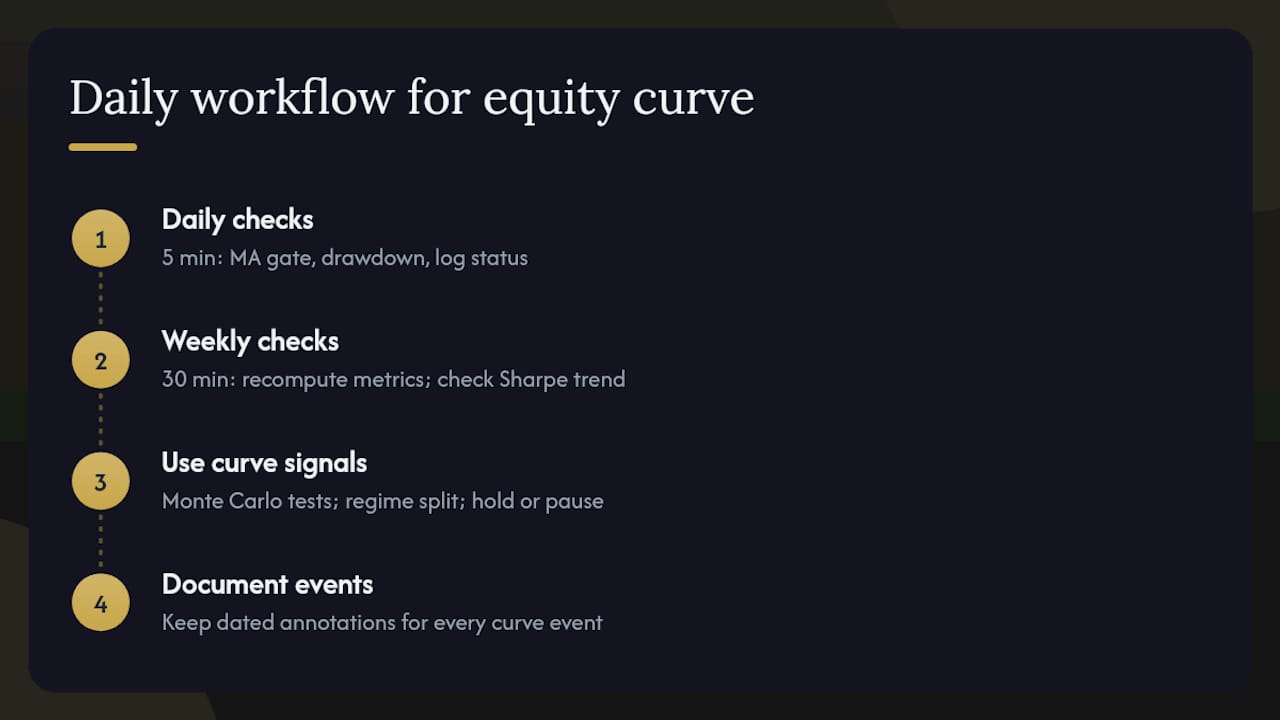
Daily checks (5 minutes)
Each morning, confirm that the live equity curve has not crossed below its MA gate threshold overnight. Check whether any new trades have extended a drawdown episode beyond the alert threshold. Log the current drawdown percentage and MA gate status. This takes less time than reading a market summary and provides more decision-relevant information.
Weekly checks (30 minutes)
Once a week, recompute rolling metrics (Sharpe, volatility, profit factor) on the updated trade log. Compare the current rolling Sharpe to the prior week. If it has declined for three consecutive weeks, that is a signal to run a fresh Monte Carlo simulation and check for regime changes in the underlying market. This is also the time to review the annotations log: every curve event (drawdown episode, MA gate trigger, parameter change) should have a dated note explaining the context.
Using curve signals to drive hypothesis tests, not emotional changes
A drawdown episode is a prompt to ask a specific question: is this within the normal distribution of outcomes for this strategy, or does it represent a structural change? Monte Carlo output answers the first part. Regime analysis (split the curve at the drawdown start and compare pre/post metrics) answers the second. Neither answer requires changing strategy parameters. If the drawdown is within the Monte Carlo distribution, the correct response is to hold the position-sizing rule and monitor. If it is outside the distribution, the correct response is to pause and investigate, not to optimize parameters on the losing period.
Documentation is the discipline that separates professional analysis from reactive trading. Keep an annotations log for every curve event. When a future drawdown occurs, the log tells you whether you have seen this pattern before and what the outcome was. That context is worth more than any single metric.
Verified gold auto-trading with a transparent equity curve
Traders who want exposure to a managed XAUUSD strategy without building their own system can review Sonicaigold's auto-trading offering. The strategy has delivered 18+ months of independently verified results, published via a public read-only Myfxbook link so you can inspect the net equity curve, drawdown history, and full trade log before committing capital.

Before allocating funds to any managed strategy, verify four things: the performance link shows net-of-cost figures, the trade log is complete (no gaps), the sample duration covers at least one significant drawdown and recovery, and the fee structure is disclosed upfront. Sonicaigold's gold copy-trading page covers all of these, including setup guides and the COPYX automatic trade-copying system that executes trades without requiring manual intervention. For U.S.-based investors, account setup and membership details are available directly on the site. Review the verified performance results and confirm the metrics meet your risk criteria before proceeding.
Sources
- Equity curve — Investopedia
- Equity Curves 101: Definition, Analysis, Calculation, and Trading Strategy Uses — Quantopia
- Equity Curve: Definition, Formula & Calculator — TradesViz
- Equity Curve Analysis — AlgoTradingLib
This article is general information, not a substitute for advice from a qualified financial advisor. Consult a qualified financial professional about your own circumstances before acting on anything here.